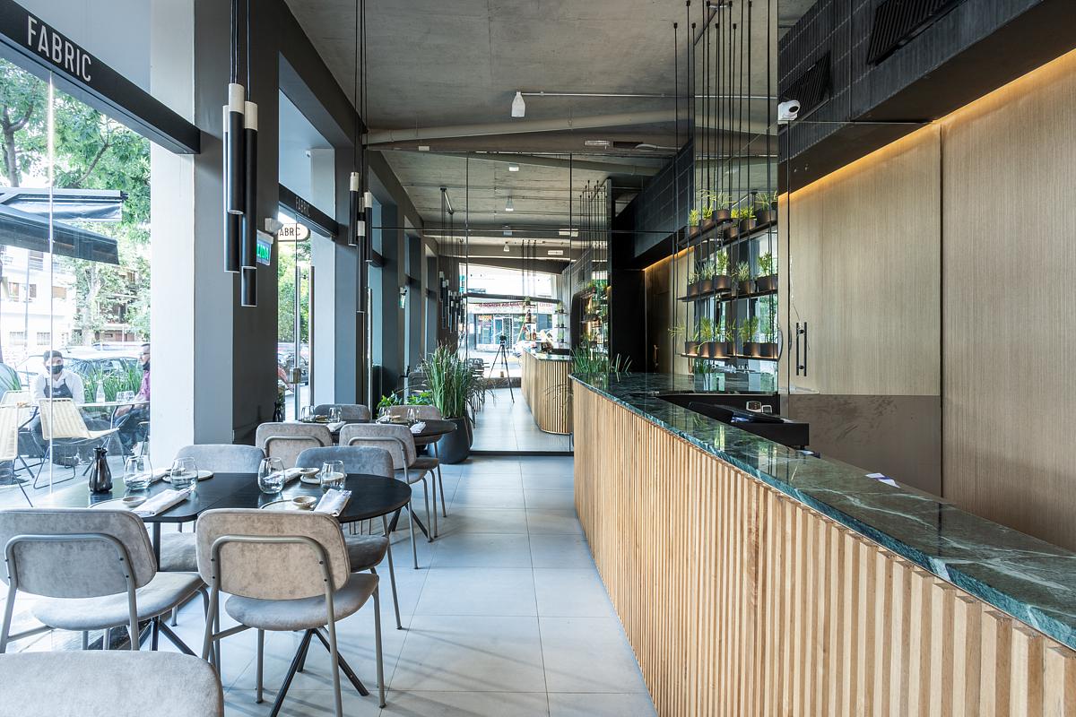
Fabric Sushi is one of the most important restaurant chains of its type in Argentina and Uruguay. Although the brand imposes certain guidelines in terms of materials and colors, it allows enough liberty on the general design so that each premise has its own caracter. There´s no store equal to another.
The design of the restaurant located in one of the main neighborhoods of Buenos Aires incorporates elements inspired by the ocean, its shapes and textures. The bar is constituted as the main element of the store, occupying practically its entire extension. The veined and greenish marble of the countertop resembles water and its caustic reflections, while the shelves hanging on top of it carry plants similar to underwater species. Over the tables, pending bouquets of luminaires of various lengths resemble the shapes of coral.
The curved line is reiterated throughout the store, both in the architecture and in the equipment. Present on shelves, tables, supporting furniture, even on the door handmade handles. The side mirror wall visually multiplies the space and reflects the light that enters through the large windows. A second mirror arranged in an “L” shape, generates a game of infinite visuals and serves as a subtle limit to the access to the bar and kitchen.
The restaurant design responds to daytime and nighttime use, with a large amount of natural light during the day and subtle lighting effects at night. Given its small surface, it extends to the street where the landscape emerges through carefully chosen plants to contain the sitting area on the sidewalk.
“For the diners’ experience to be complete, senses must be stimulated not only from the menu, but also from the architecture”
Questions and Answers
FoodInSpace
What were the challenges of the project?
Muro Studio
There was just one big challenge, the space. The brand needed a big kitchen space to make the diary production of sushi, not only for the restaurant salon but also for the deivery, wich had a lot of demand. What is more, when restaurants appear to be in corners, they have difficult angles to solve. We decided to design a large kitchen and a interesting space for the sushimans to work visible for the customers. The angles started to dissapear when curves were taken into the project.

