Client’s Design Brief.
“ The current humpback is a convivial space focusing on fresh, seasonal seafood with a curated wine and cocktail list. The venue welcomes seafood lovers from all over the world, arriving at Humback to enjoy the ever-popular fresh oysters offerings directly from Hama Hama Oyster Farm. Besides dishing out selection of seafood, Humpbaack hosts events to engage the community – such as Oyster Polling Day and Sous Chef Sundays.”
“ The space needs to feel welcoming, comfortable, communal, approachable. Rich in texture and colour with a breezy alfresco.”
“The food will showcase a higher technical flair and precise plating, and the dining room of the restaurant will be more comfortable with decor that is richer in texture and colour.”
“ The refreshed Humpback will retain the same passion for fresh oysters – 36 hours from farm to table – and seasonal seafood and produce with a focus on provenance. Beverage offerings focuses on a curated and ever-evolving wine list served with the group’s signature style of convivial hospitality.”
Design Approach:
Humpback was born from the client’s holiday experience, specifically a trip to the fifth generation family-run Hama Hama Oyster Farm in the Pacific Northewest of the U.S.A. It opened its doors as a breezy yet cosy Seattle-style neighbourhood restaurant in 2015.
Since then, Humpback has established itself with a strong clientele who appreciate their approach towards fresh seafood and flavours.
Eight years on since Humpback was launched, it certainly was time for a refresh. With the client’s thoughts in mind, and in keeping with their strong brand philosophy of conviviality, my design approach was to create a space that exudes a vibrant and yet a relaxed and unpretentious atmosphere. What came to mind was the colours of dusk and sunset, and the feeling that one gets when one is watching a sunset, this was precisely the vibe I wanted to impart to the space.
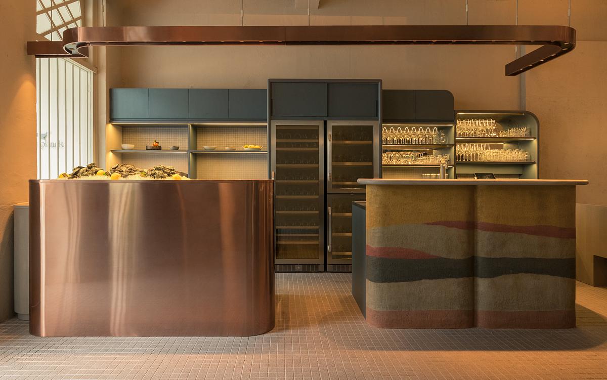
Hence the colour palette incorporates moody tones of grey, seaweed green, leaf green, mustard yellow and copper. The space is set in an old shophouse, I love the original bones of the shophouse and I wanted to expose the existing beams, partly dilapidated cornices and original uneven texture of the walls. I felt that this would give the space more character, but yet modernized it by painting everything in one colour – bone white. The pops of colour would instead come from the joinery, fabrics and coloured glass. The timber used is a smokey grey wash. The raw bar counter fascia is wrapped in copper sheet. A multi-coloured, wave patterned ramped earth clay plaster is applied to the fascia of the wine bar counter. This was by Clayworks Uk, and supplied and installed by Rubiks Lab.
The layout of the space has been completely reconfigured. The wine bar and raw bar counters have been brought to the front, adjacent to the main-entrance. This allows for a bigger dining area and the voluminous ceiling height can be better appreciated. The ceiling height has been further emphasised by hanging lamps which are Louis Poulsen’s VL45 Radiohus Pendants, recycled from the previous space. Banquette seats line the right wall and are countered by a bank of booth seats on the opposite wall. These are upholstered in grey and leaf green fabrics, framed by smokey grey timber combined with low level LED uplighters, making the space intimate and cosy. The recurrent quarter round-shaped arches softens the space with it’s sweeping gesture.
The dining chair is inspired by Joe Colombo’s 1960s dining chair, and was constructed by Fiske Furniture.

