Hidden in an architectural wonder amongst the monumental skyline of Riyadh, comes a new speakeasy concept. In a somewhat abandoned Kenzo Tange residential building, dubbed the Airline Building, thanks to travel agencies once occupying the retail spaces on the ground floor, Kimyona hopes to breathe new life. Kimyona, meaning “strange, quaint” in Japanese, is a space that is designed to leave exactly that impression. The new, homegrown speakeasy quietly sets itself within the building. Inspired by analog black-and-white photography, the design aims to manifest the process of photo development into a spatial experience. More so, the design of Kimyona creates a journey of discovery for the customers to travel through. At the entry, the only space visible from the shop exterior, one enters a photographer’s gallery. The gallery, with its bright lights, neutral tones, and minimal materiality sets a zen-like atmosphere, where the art being presented takes precedence.
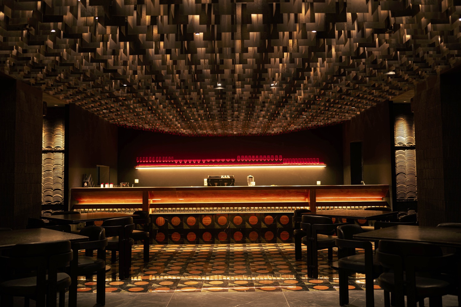
Through one of the art pieces, hides a secret passage. The hidden door is a conduit for a dramatic transition into the main dining hall. The dining room resembles the photographer’s darkroom laboratory, featuring dark interiors, complemented with dimmed lighting. Contained within glass brick glazing, the experience for diners is focused internally, offering less distractions from the outside. On a street level, the glass bricks offer a unique perspective into the restaurant, through obscure translucency, the movement of light and shadows drives curiosity into the mysterious venue without giving too much away.
The dining room features a main design element, the suspended steel ceiling structure, inspired by hanging photographs in a darkroom. The central ceiling structure, featuring the metal sheets, contributes to creating a focal moment of attention towards the bar. The design seeks to achieve another objective simultaneously; to celebrate the Asian cuisine of the brand. To do so, the walls are cladded with reclaimed ceramic Chinese roof tiles. The design uses materiality to create texture and contrasts given the limiting brand color palette of only black, white, and red. With natural stones, ceramics, and steel the design creates a unique play of warmth, coolness and neutrality.

