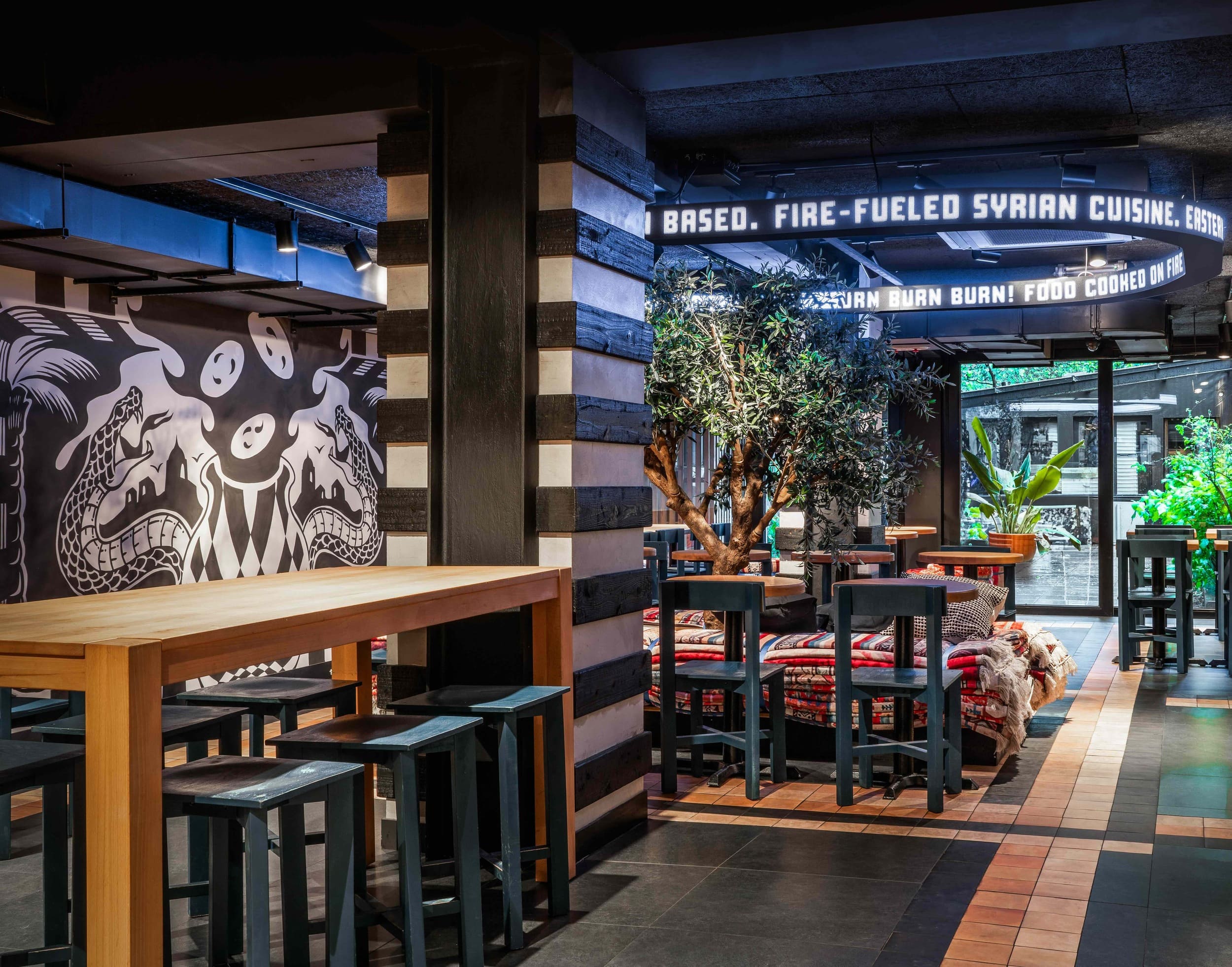
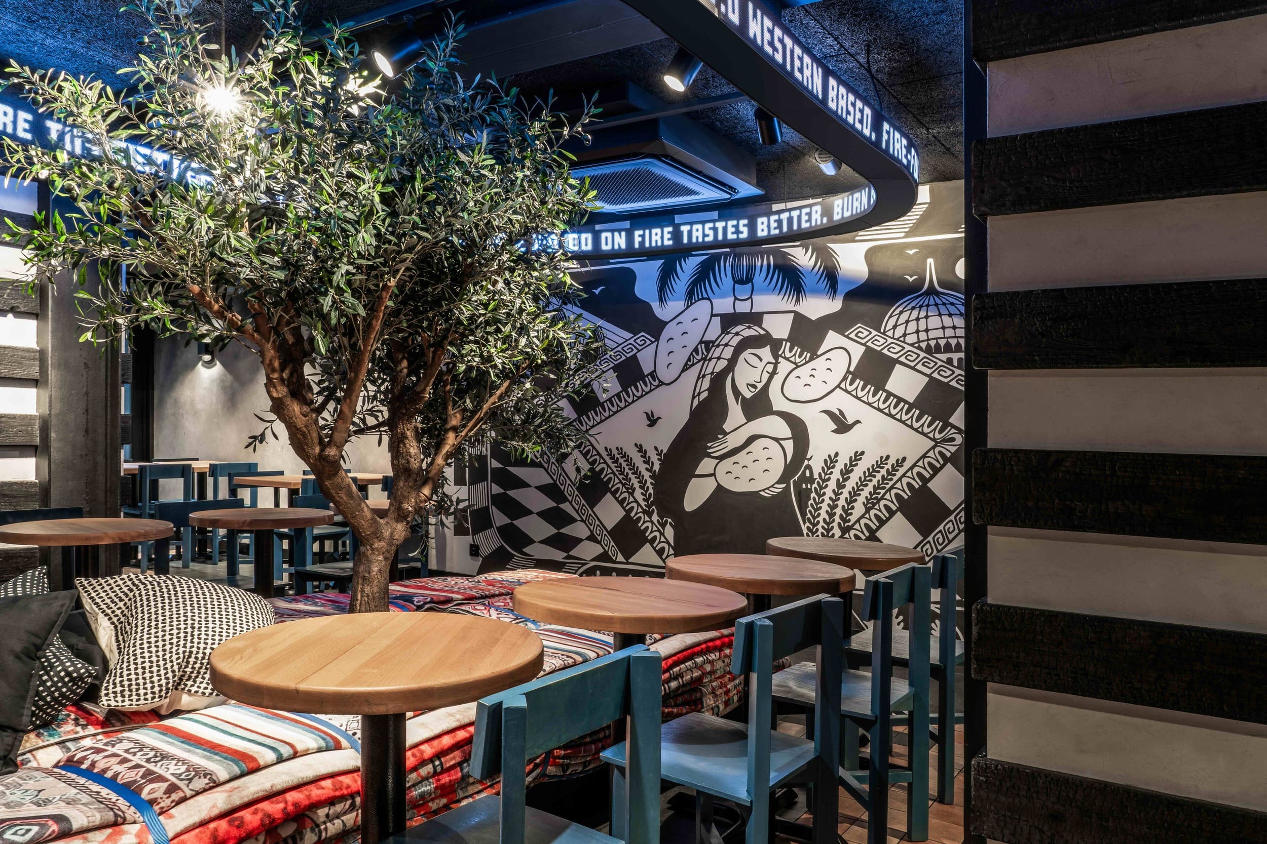
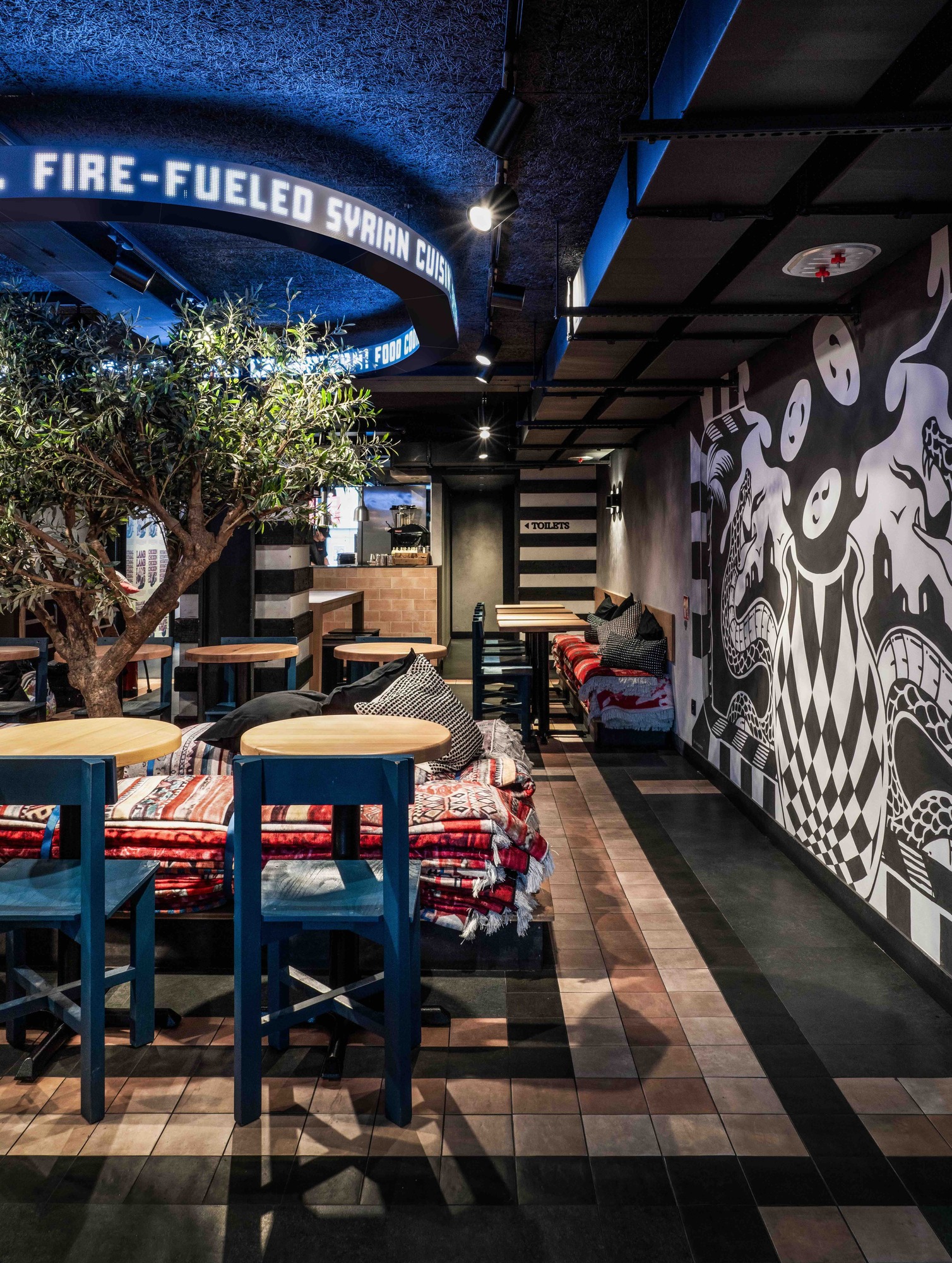
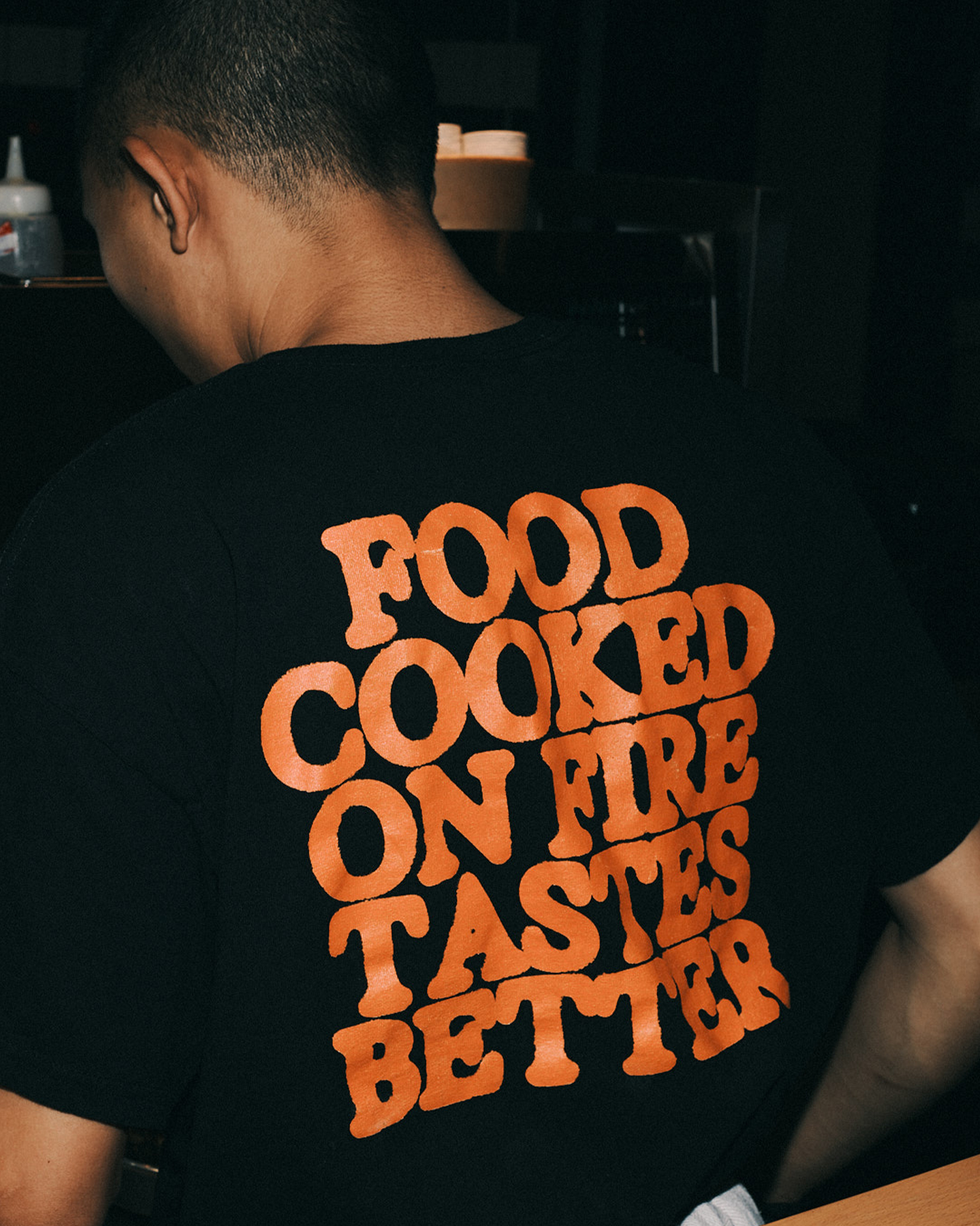
Western based , eastern raised.
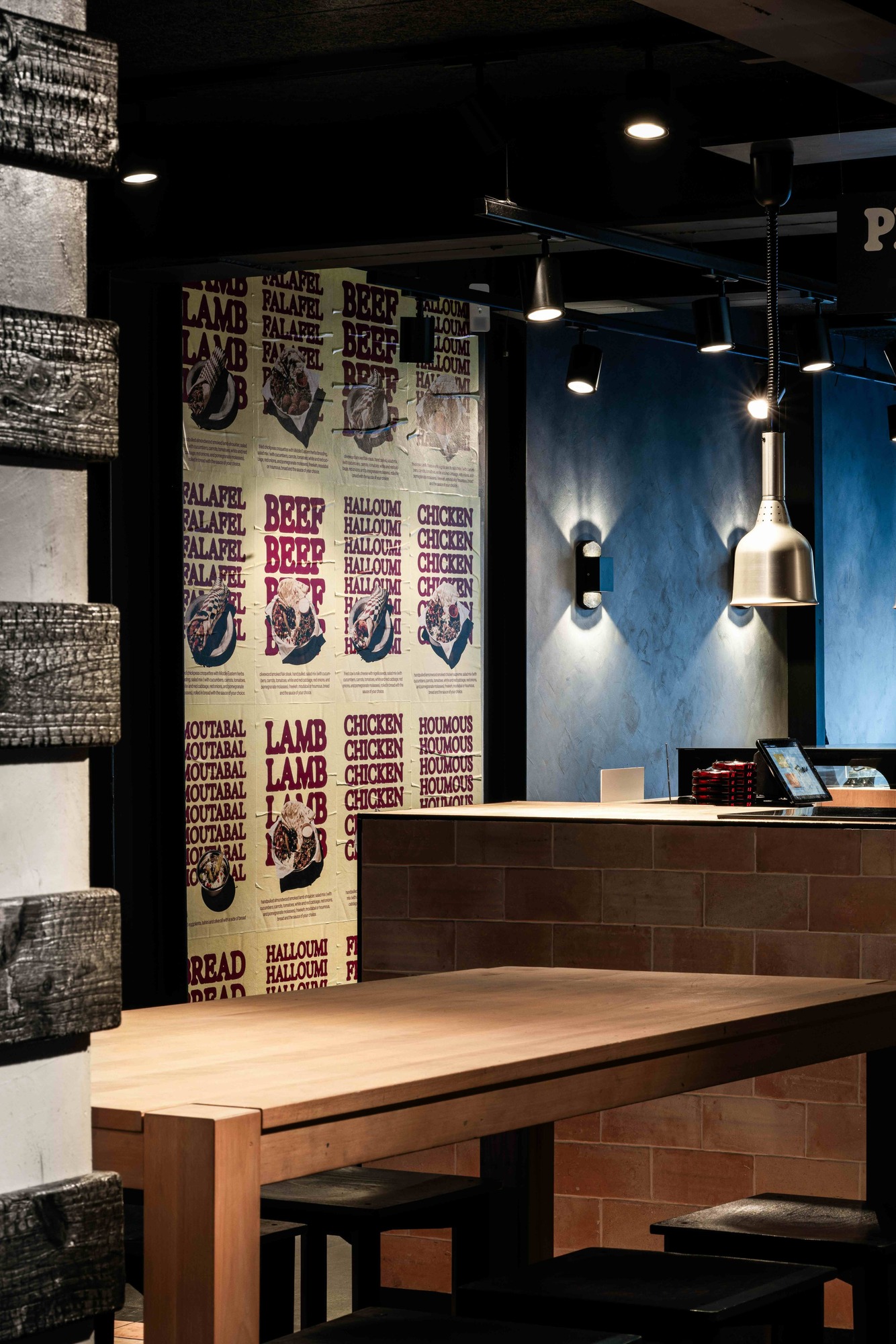
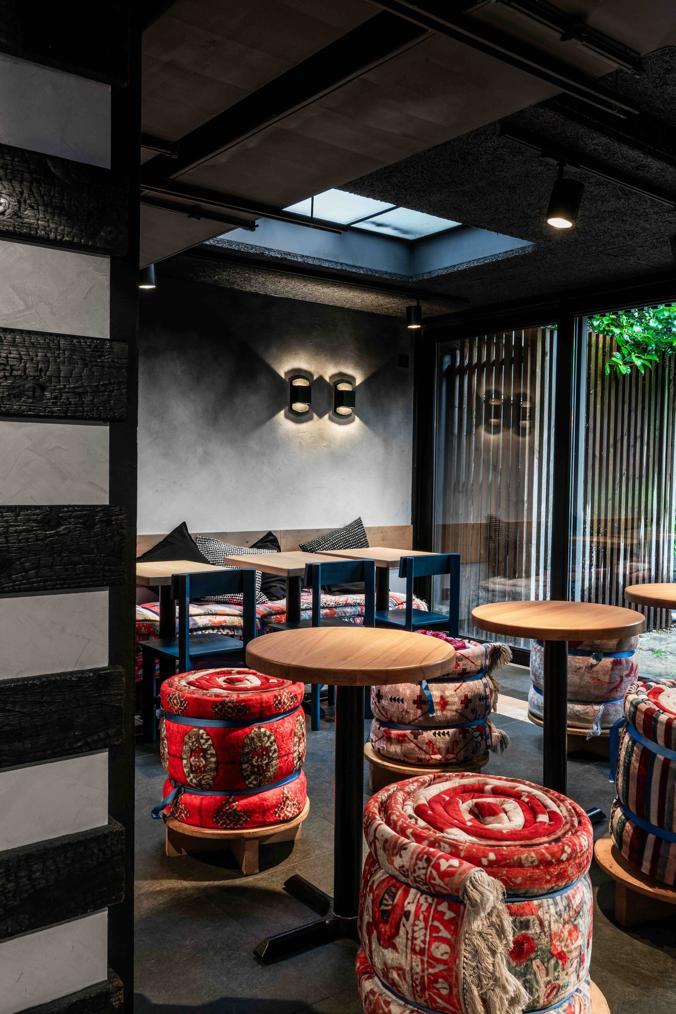
My Tannour’s identity overhaul brought Syria’s essence to life in the heart of Brussels. Each location now feels like stepping into a traditional Syrian home, while blending Eastern cultural roots with the Western lifestyle to create an eclectic mix of patterns and flavours.
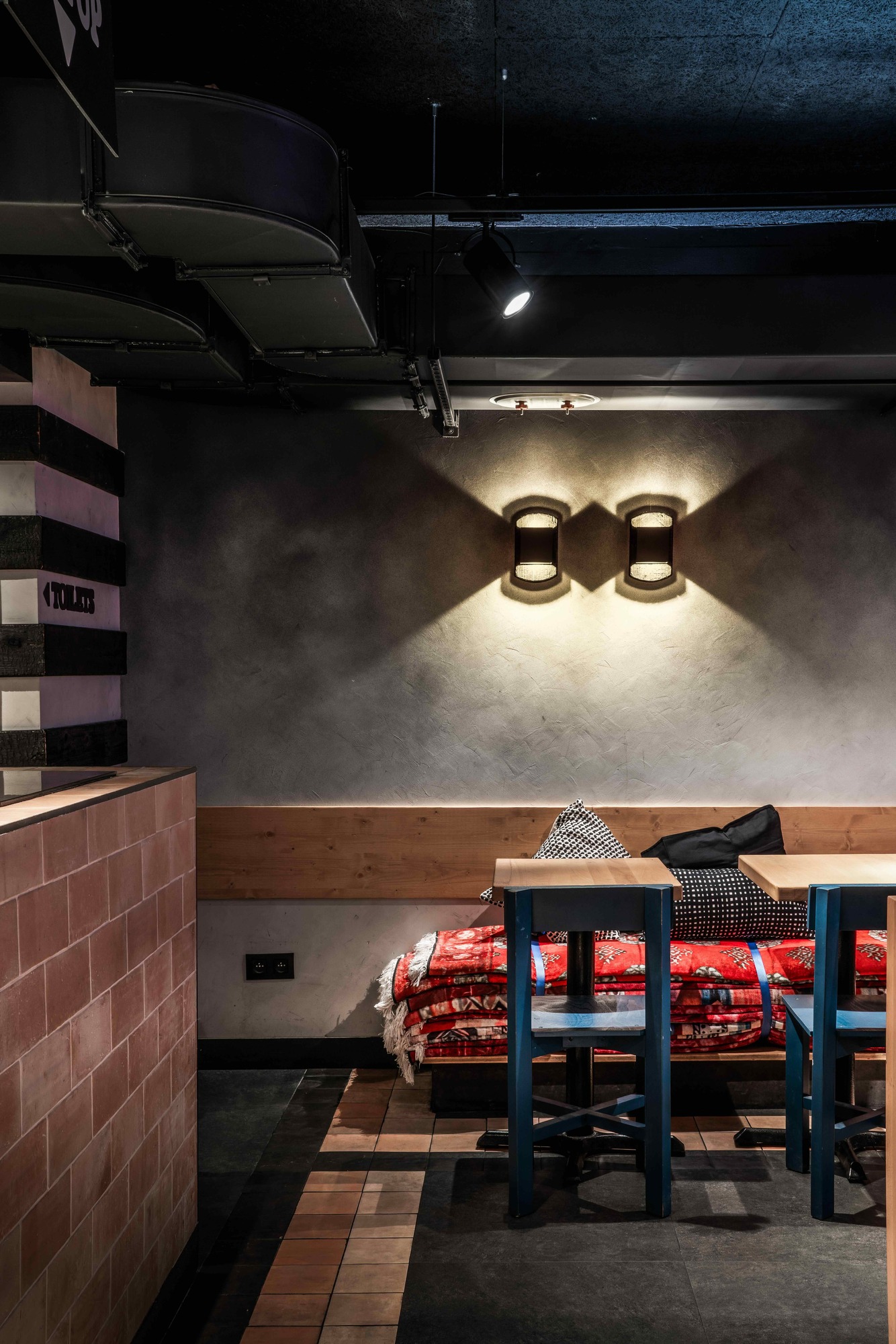
Colours evocative of the local culinary tradition, such as charcoal and smoke, infuse the space with vibrancy. An olive tree at the centre adds an Eastern touch.
The logo features hand-drawn lettering made with the actual charcoal from the tannour itself, adding a touch of roughness to the identity.
By adding filters to a base diamond pattern, a set of patterns was created that form the base of the identity with a clear nod to the eastern culture. Adding to the unpolished feel of the identity, we use a grunge filter on text and patterns.
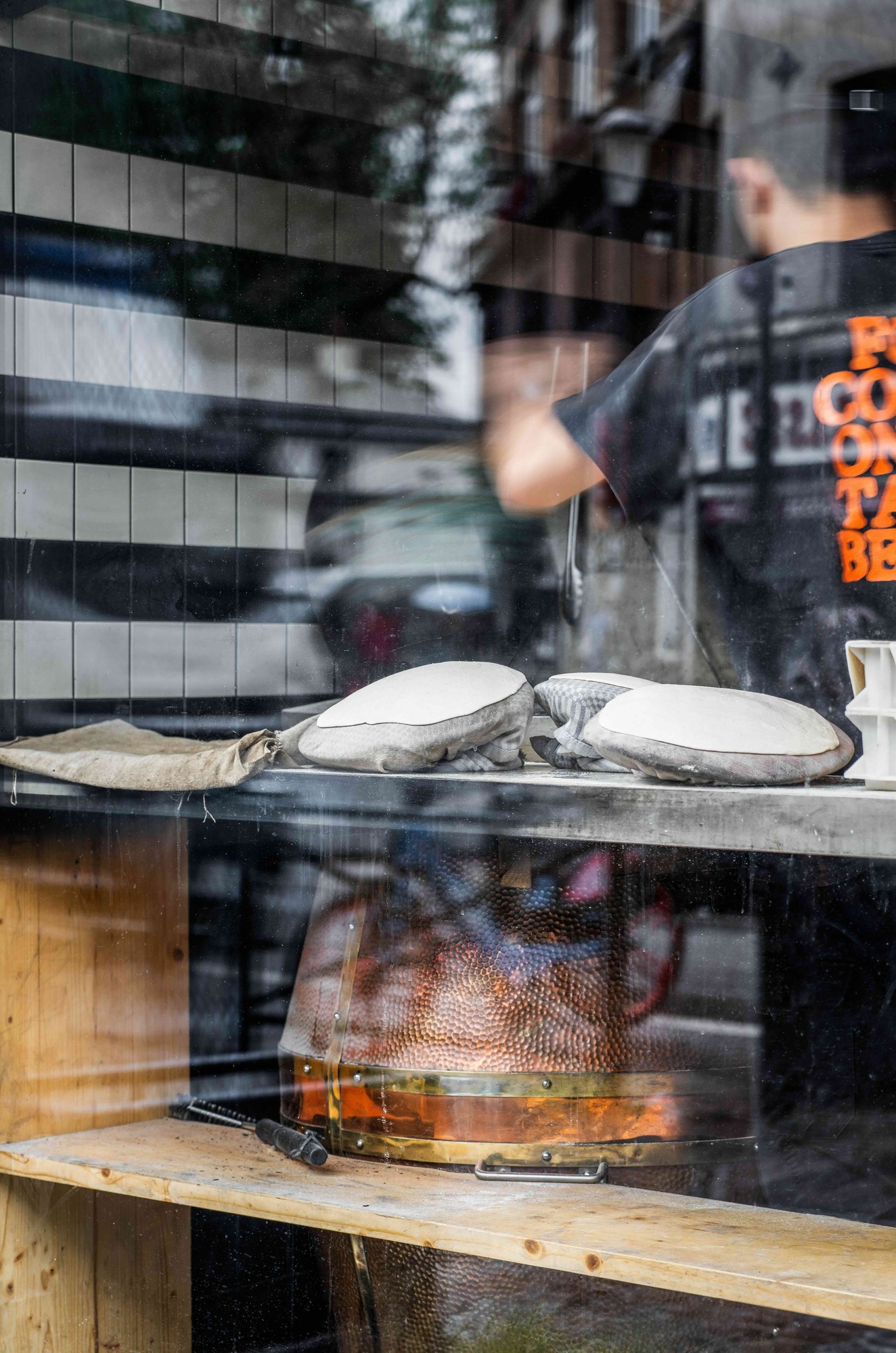
Exposure is a serif typeface that emulates varying levels of photographic exposure or ink spread, or in our case different timings of the baking process. The inflated feel of the letters mimics the blow-up effect of the bread in the tannour oven. Both typefaces counterbalance eachother. The boldness of Exposure is juxtaposed by the clean and minimalist character of Neue Haas Grotesk.