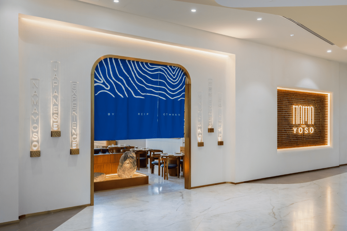
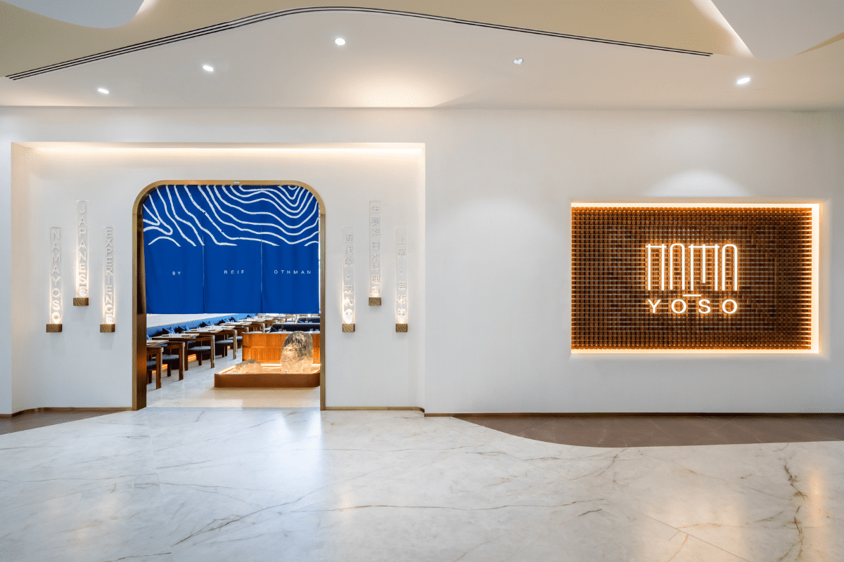
At the heart of Nama Yoso lies the essence of “Raw Materials,” a concept that profoundly influenced every aspect of its design. The branding concept, developed by TwentyOne06, reflects a commitment to natural elements and Japanese traditions.
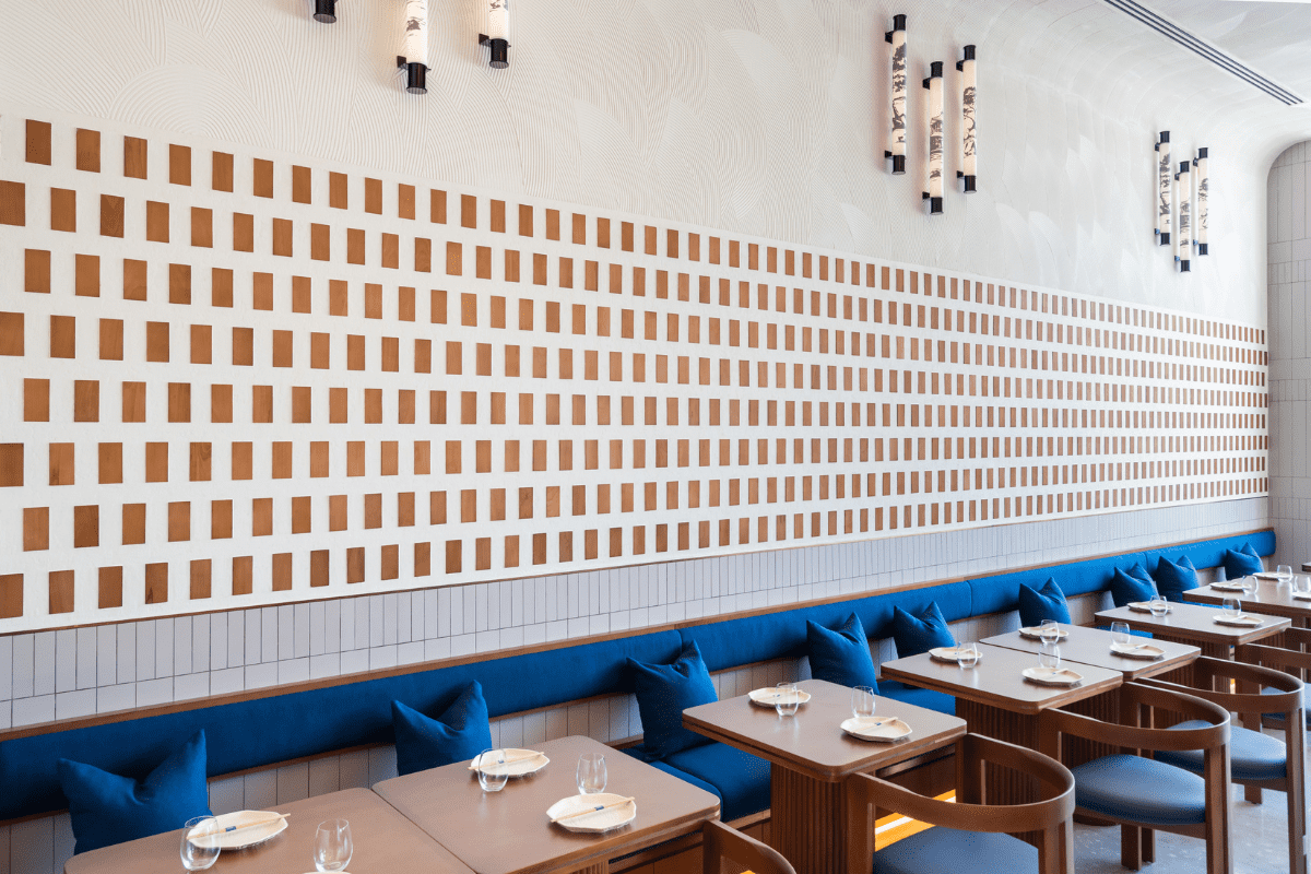
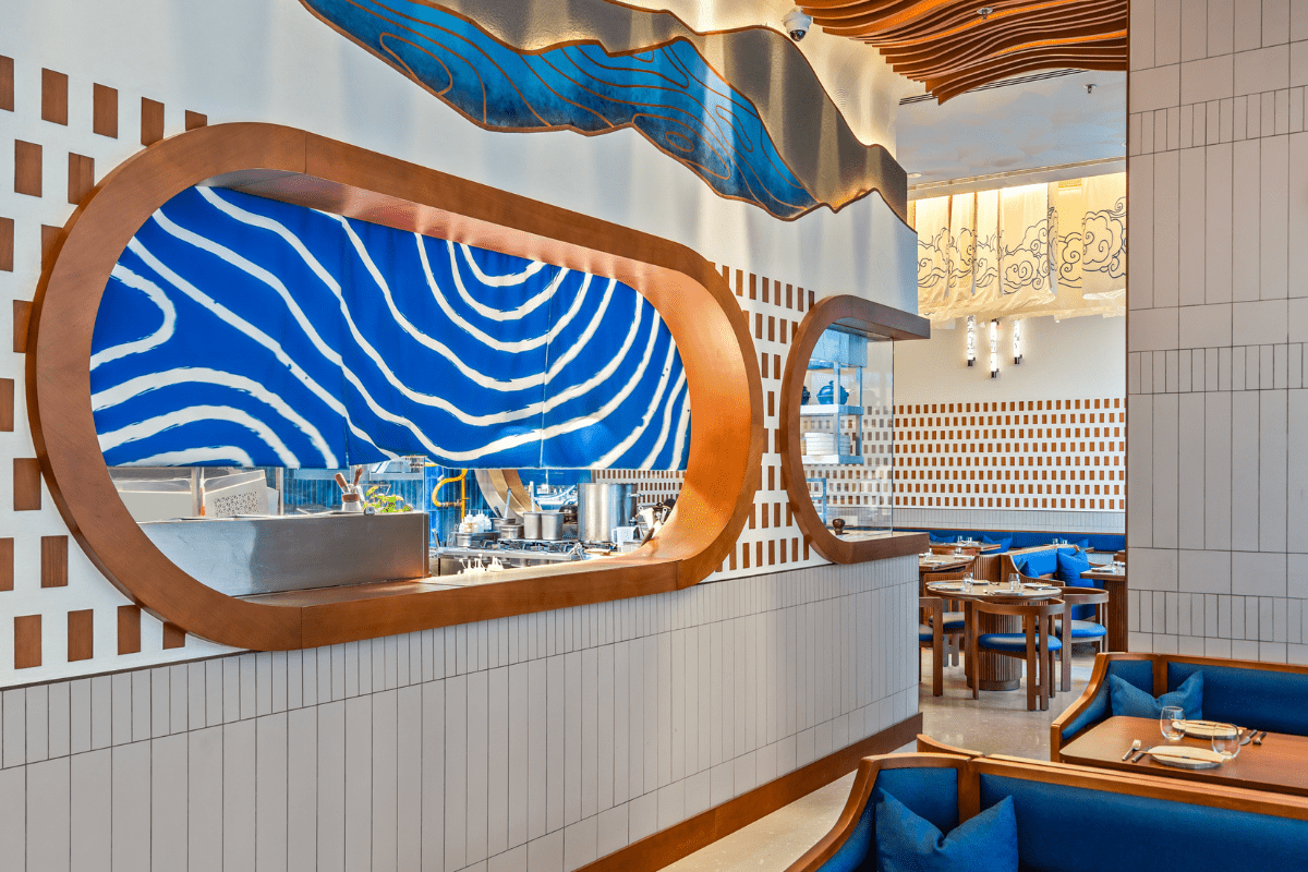
Drawing inspiration from the sea and water, the restaurant’s distinctive blue color, reminiscent of the ocean, symbolizes tranquility. The orange hue roots in raw salmon, while beige tones pay homage to traditional Japanese canvases and wall partitions. The brand pattern, resembling Damascus steel, epitomizes a traditional Japanese forging technique, creating a cohesive and meaningful narrative for Nama Yoso.
The Interior Direction:
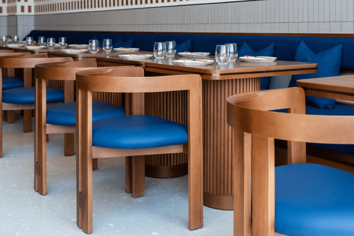
A robust branding and storytelling concept masterfully guided the interior design of Nama Yoso. Inspired by TwentyOne06’s comprehensive “Nature Provides” research report, the restaurant’s color palette and brand pattern were curated around the essence of raw ingredients, drawing inspiration from elements like salmon, ocean blue, and traditional Japanese cutting techniques. The material selection, marked by natural wood, natural stone boulders, and brass accents, seamlessly complements the restaurant’s brand direction, creating a cohesive and immersive ambiance.
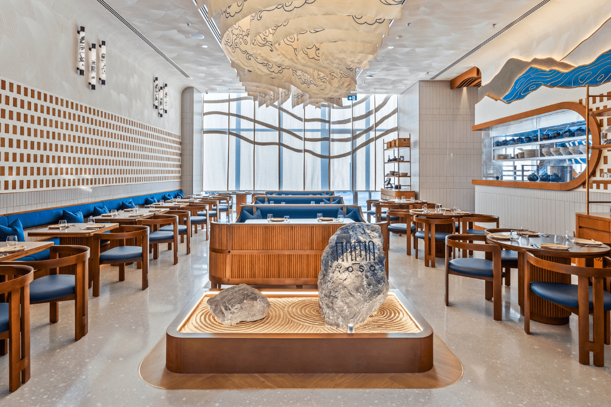
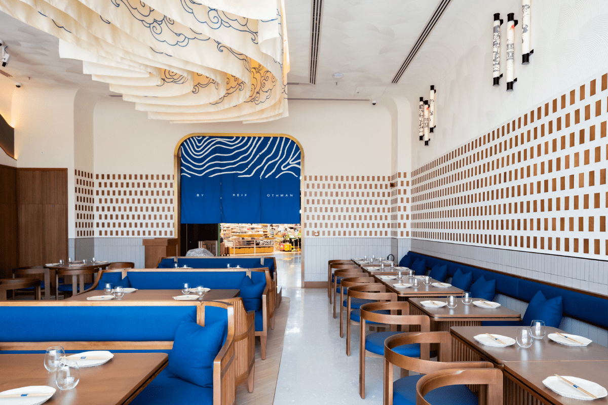
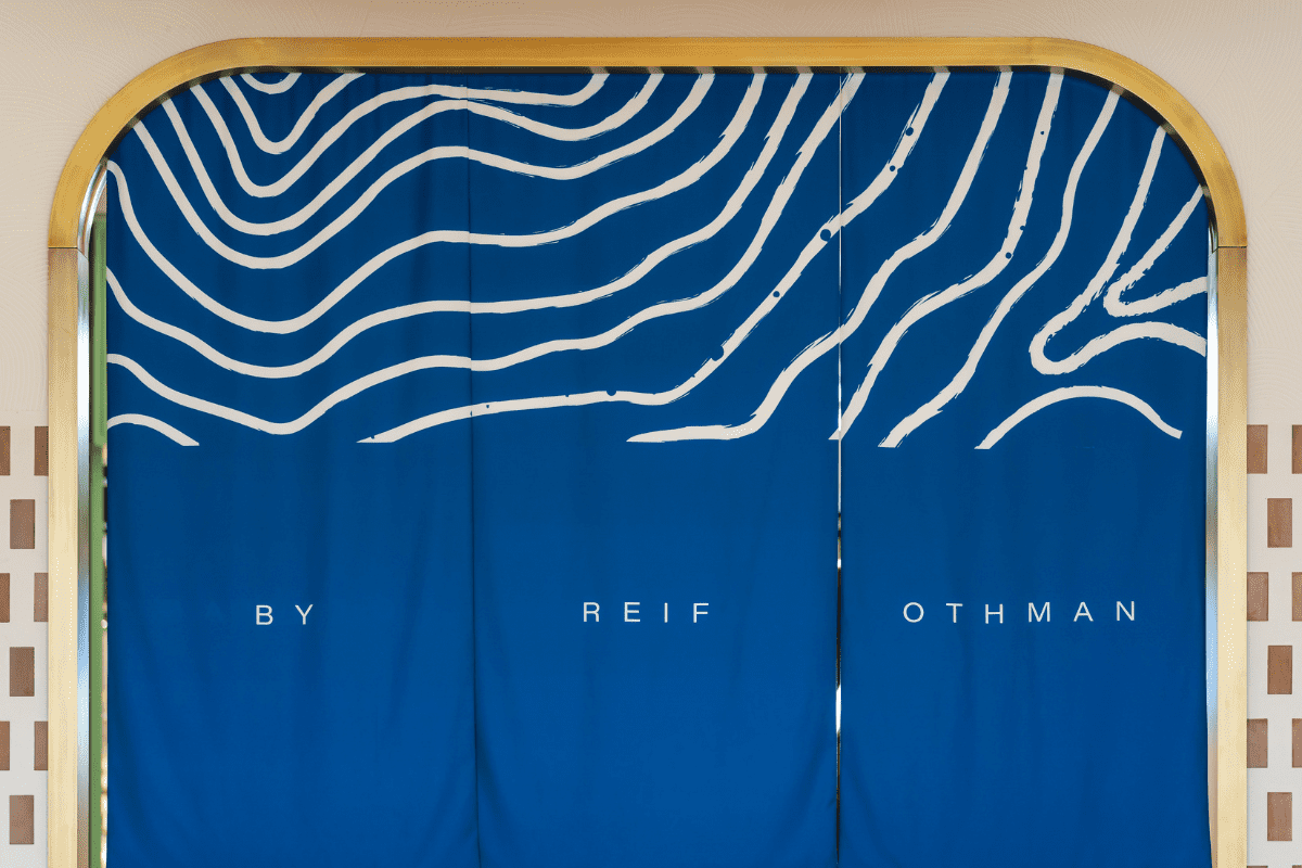
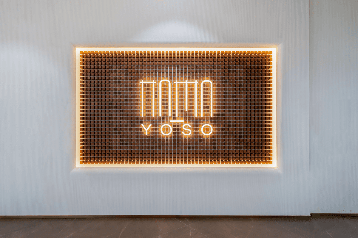
1) Entrance design: Adorned with traditional Japanese blue Noren curtains, it sets the stage for what lies within. A striking facade, featuring the restaurant’s illuminated logo and wooden blocks engraved with Kanji lettering, welcomes guests with a unique blend of traditional and contemporary design.
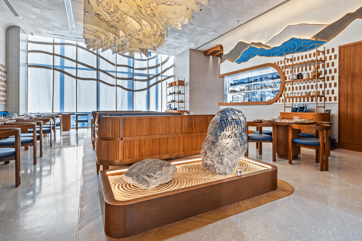
2) Zen Garden feature: Utilizing a combination of sand and stone, this design features the restaurant’s engraved and painted logo. Each boulder was hand-picked for the design, adding a distinctive touch to the overall aesthetic. Placed thoughtfully on a bed of raked sand, following the brand pattern’s design, these boulders become a harmonious extension of the restaurant’s natural narrative, providing a tactile and visual connection to the earthy elements woven into the design.
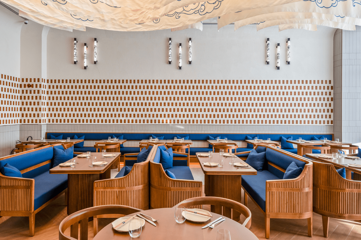
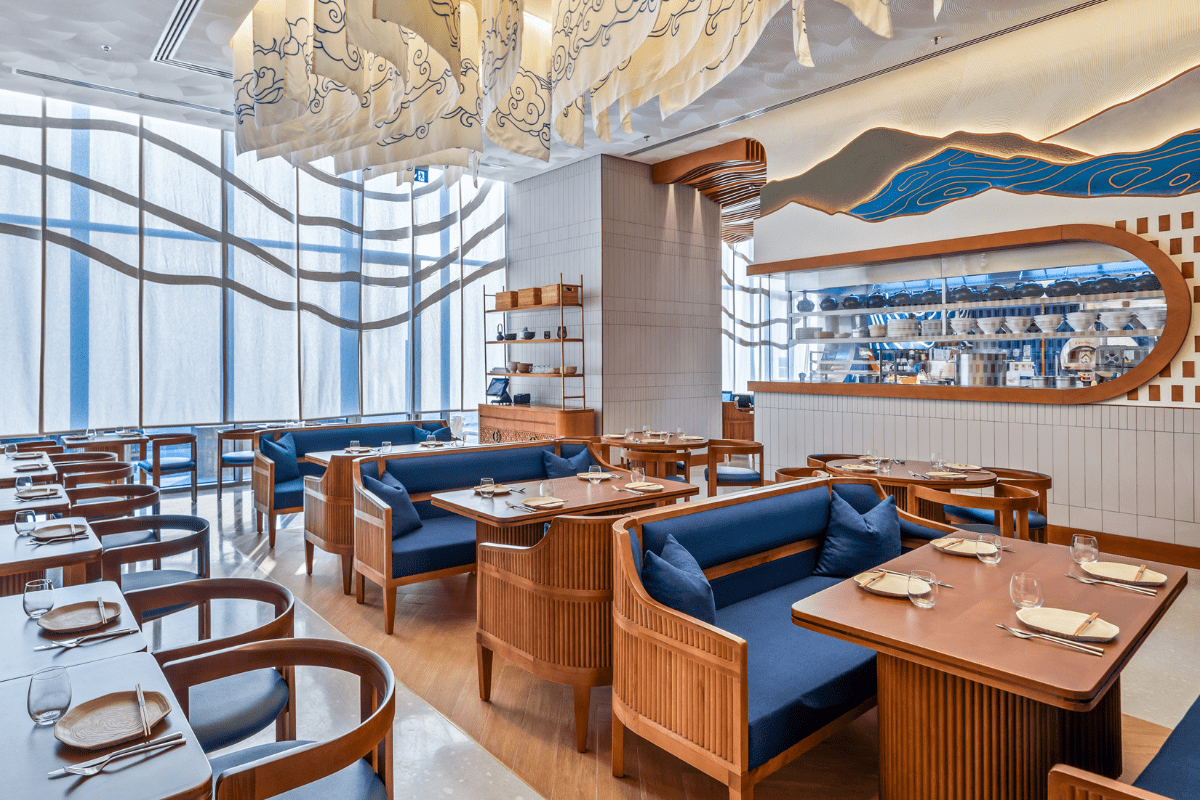
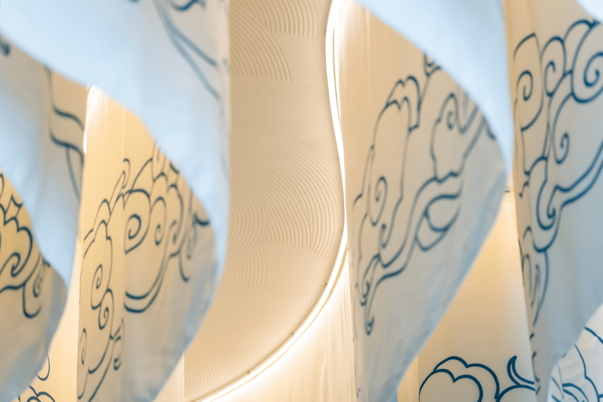
3) Ceiling design: The central ceiling feature above the main dining area at Nama Yoso was a key element. Adorned with beige linen and canvas fabric curtains, featuring traditional Japanese drawings, it strategically reflects the brand pattern. Woven fabric with blue wave-like patterns and flexible light strips creates a visually captivating design element.
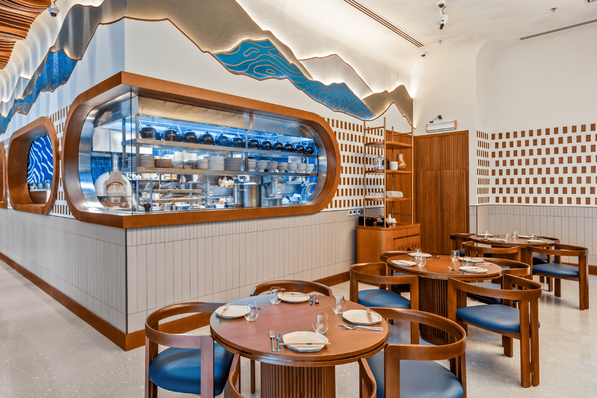
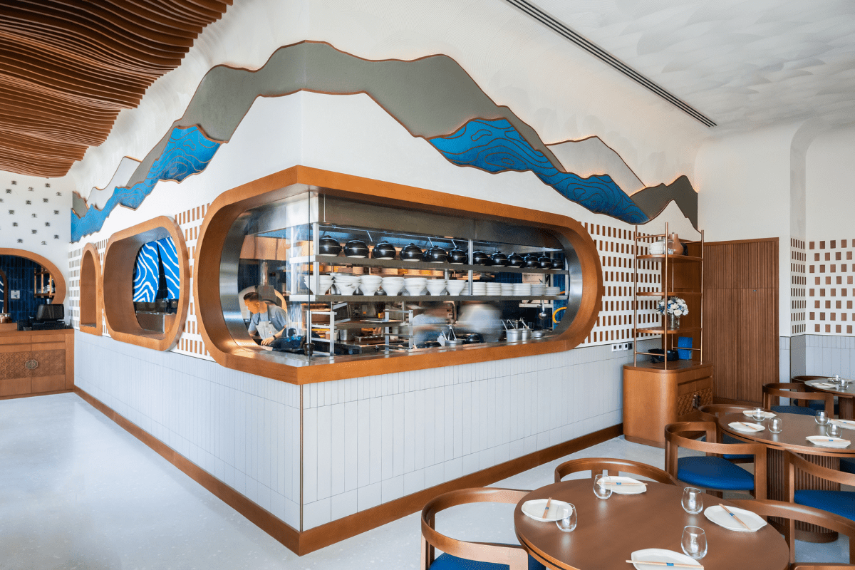
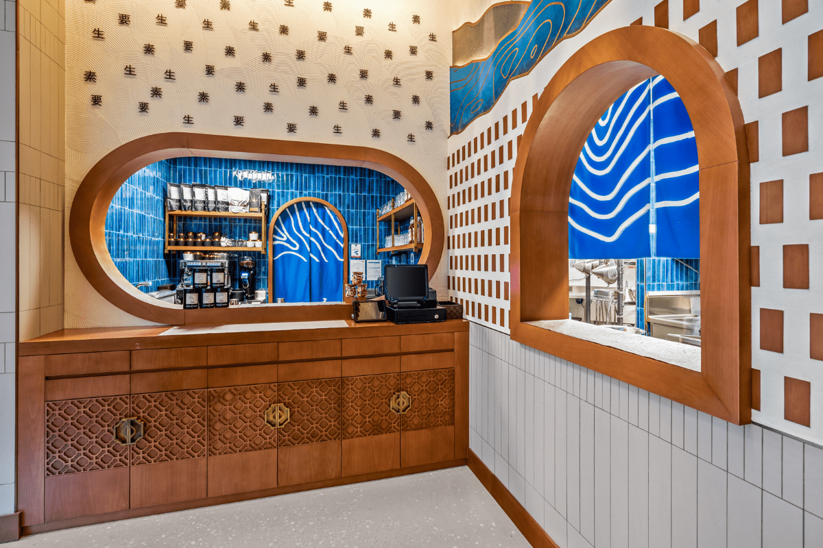
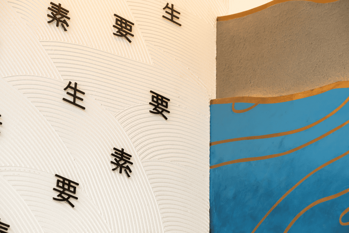
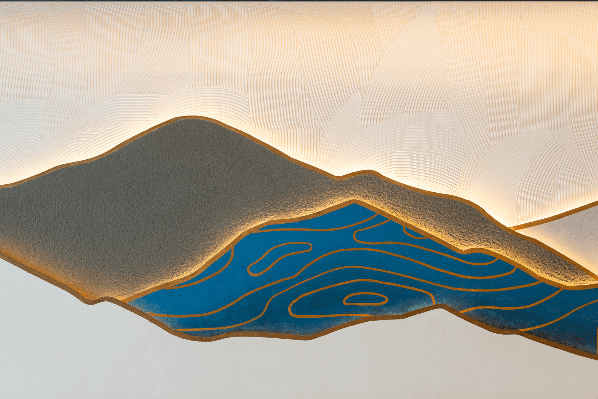
4) Wall Finish and Textures: Nama Yoso’s wall finishes transcend aesthetics, becoming integral storytellers. The mountain wall is a heroic design element, evoking a strong sense of brand identity. Bespoke concrete texture finish, top-edge brass finish, and strip lighting bring this mountain wall pattern to life. The kitchen wall is adorned with individual Japanese Kanji letters, adding a touch of cultural authenticity.
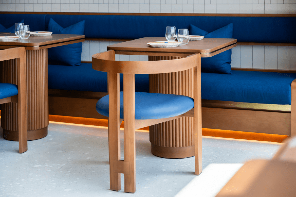
5) Furniture: Bespoke furniture, thoughtfully arranged, maximizes space utilization and elevates the overall guest experience. Circular and rectangular natural wooden tables with ocean blue leather upholstery and fluted skirting provide a harmonious blend of comfort and brand appeal.