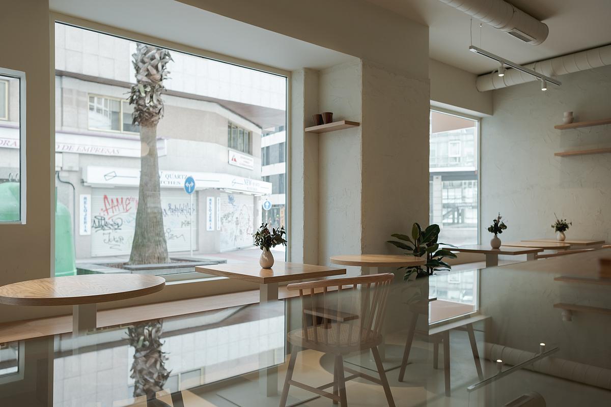
A cafe with a healthy workshop.
The premises to be acted upon were already a space in operation and very successful, the purpose of the intervention was to expand and update the premises.
Our clients wanted to expand the space and provide a homogeneous image to it.
The intention was to carry out a contained intervention, preserving much of what was pre-existing, but carrying out a substantial transformation.
The solution was superficial, providing color and texture on all walls. This, together with a change in lighting and furniture, made the change very important.
The company’s philosophy is to be very sustainable, concerned with the environment and with a healthy product. Therefore, the image that was wanted to be conveyed had to be in line with these values. In this way we tried to give the brand’s users the feeling of being in a unique and committed place.
To achieve this, it was decided to introduce “masses” of color that ran through all the planes, providing different textures in various finishes. For example, a groove was introduced on the exterior face of the bar that makes it a differentiating element.
That is why at the level of materials we tried to ensure that what was introduced was organic and natural.
The environment is complemented with careful lighting, seeking to emphasize those elements that we consider most important.
We seek to organize the space in a way to optimize the number of diners, introducing two large benches running along the longitudinal direction of the space.
A large bar helps to ship the product produced in the workshop and helps organize the cafe space.

