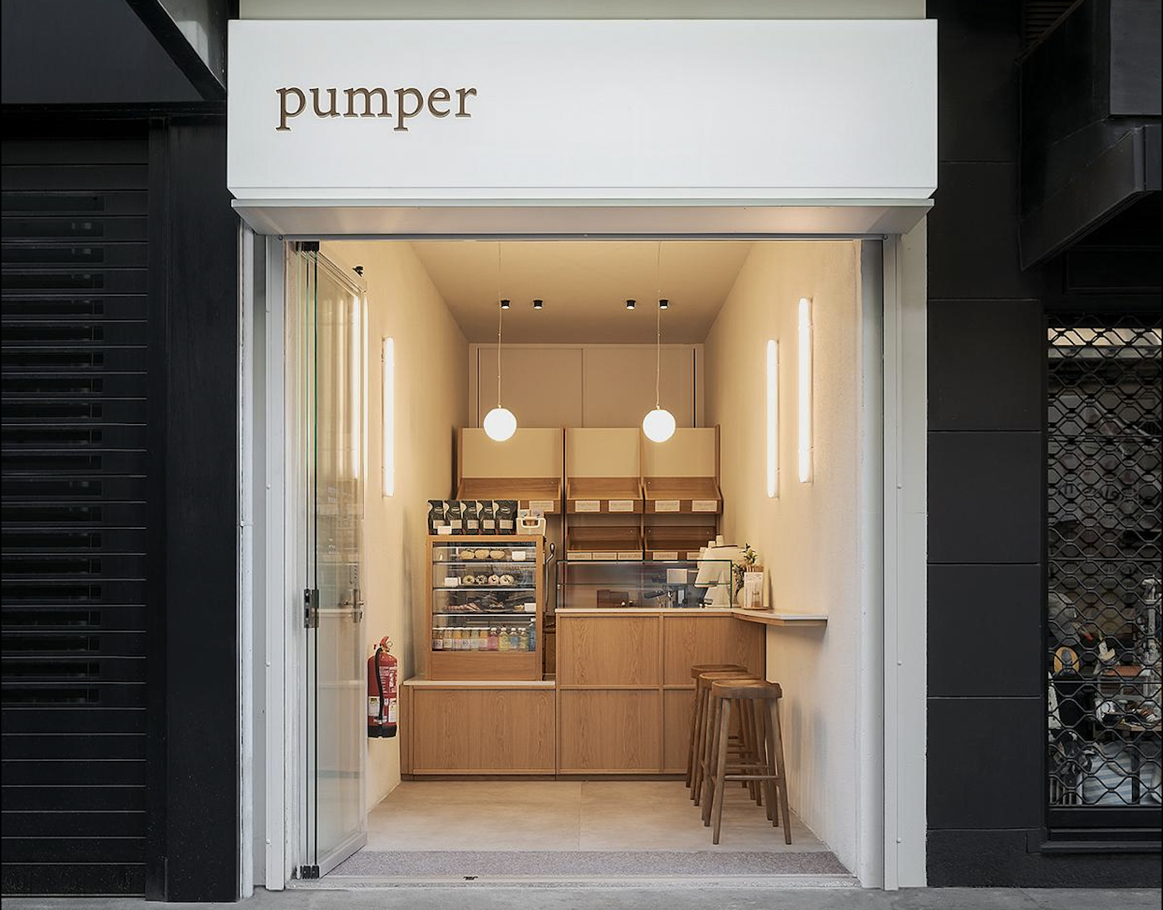
Bakery and cafe take away project in a minimal space.
The image is an aesthetic continuation of the space previously designed by our studio for these promoters, the main cafeteria.
The idea is to continue in this very small space with the sustainability values of the Pumper philosophy, through materials and a minimalist design.
The challenge is to combine in such a small cabin all the necessary sales and exhibition functions with the clean and minimalist appearance that is sought as an image.
A set that seeks a very homogeneous appearance in all its elements. Sustainability and tradition are the messages we want to convey, for them we work with mortars and combine them with wood to transport us to the idea of firewood, the main element in any bakery of yesteryear.
Clean and minimalist lighting is also sought. We look for a well-lit space, avoiding the formation of shadows and looking for clear light. The lighting elements are geometric shapes without any type of ornamentation.
Functionally, the aim is to move this small space to the street; it is so small that the project can be translated as a small shelter at street level.
This website uses cookies so that we can provide you with the best user experience possible. Cookie information is stored in your browser and performs functions such as recognising you when you return to our website and helping our team to understand which sections of the website you find most interesting and useful.


