“Agamograph” by Yaacov Agam
Agamophraph is a print that uses barrier grid animation to present radically different images, depending on the angle from which it is viewed.———-
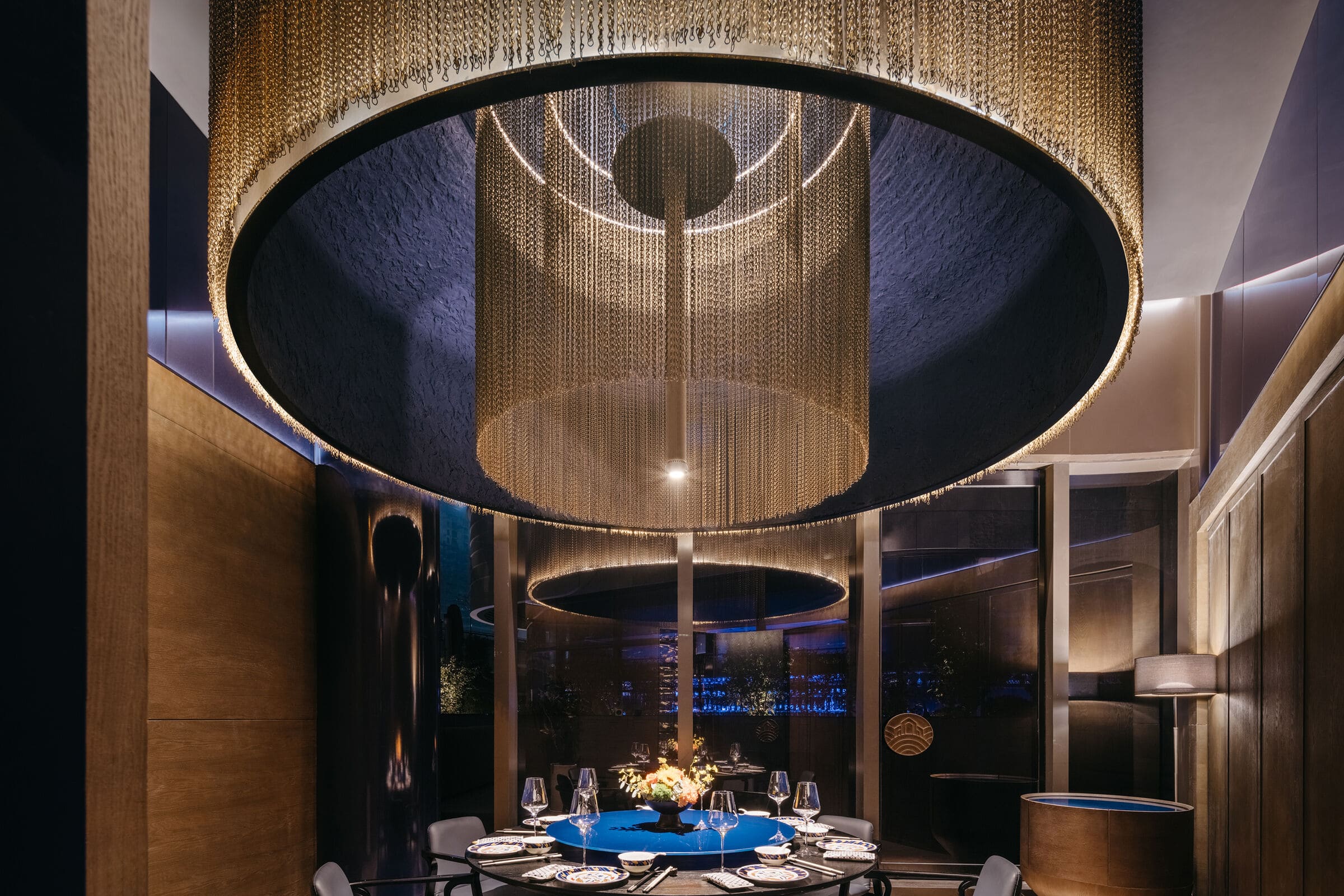
“TIDU RESERVE”, a well-renowned Beijing restaurant, debuted in Shanghai at “Taikoo Li Qiantan,” the design concept is inspired by the Beijing Roast Duck cuisine, which is unique for its superposition of layers. The same layering idea can be found in the Tidu graphic logo, using a Chinese official uniform’s “Tide and Cliff” pattern and blue and gold as the primary colour. “Gathering Beauty” metaphorically refers to bringing together beautiful elements, such as a delicious fusion of flavours and diverse images reflecting traditional Chinese beauty ideals. These elements come together in the restaurant, enhancing the dining experience. The space embodies this concept.
The overall space is divided into three areas to meet operational needs: the bar area, dining area, and outdoor central garden area. While each area appears independent, they mutually support diverse needs. Simulating the scene of seawater flowing through coastal rocks, inspired by the official uniform pattern, the design employs blue, gold as the main color, red as the auxiliary color, fully used in the space.
Drawing parallels with Yaacov Agam’s “Kinetic art,” TIDU’s conceptualization reflects the artistic philosophy of visual illusion through layering and gathering methods. Through the design approach of “layering,” RooMoo aims to create the conceptual framework of “Gathering Beauty” and a continuously changing “visual illusion” imaginative space of the restaurant. Moreover, RooMoo uses the dynamic visuals of “Tide and Cliff” to simulate the overall interior, with each area resembling seaside rocks.
In Yaacov Agam’s artistic philosophy, we can observe the “visual illusion”generated by the aesthetics of movement. This state of “visual illusion” arises from the creative methods of layering and gathering. Similarly, through the design approach of “layering,” we aim to create the conceptual framework of “Gathering Beauty” and a continuously changing “visual illusion” imaginative space for the three areas.
The semi-spherical GRG ceiling, adorned with layers of blue and beige paint and golden metal chains, simulates the dynamic imagery of seawater washing over gold ore. Four different assembly methods of blue and golden glass bricks on the walls provide varied visual perspectives for guests.
With its layered plant arrangement, the outdoor central garden area guides guests through a relaxing and secluded dining experience amidst lush greenery.
The outdoor bar counter features coffee-coloured stainless steel arcs with LED lights, creating a visually layered effect at night. The ceiling, showcasing a logo on glass panels through stacking, offers a dynamic view from different angles. The bar shelf, composed of overlapping blue semi-circular stainless steel panels, adds visual variety.

