Yamazaki Bakery entered Shanghai since 2004, and its headquarter was built up in Tokyo, Japan. It was established in 1948 and has a history that more than 70 years, a well-known bread brand in Japan. Yamazaki pursues delicious and health with the purpose of high-quality bread and attracted more Chinese consumers.
Tens Atelier was invited to design the store for Yamazaki in Shanghai Jiuguang Center. As the second one in Shanghai, it was not only represent the development trend of era which was brand-new project leading the consumption upgrade of Shanghai consumers , but also inherits the “Shopping Characteristic” of Shanghai’s humanistic memory.
Compared with the current fancy bakeries, Yamazaki has been dominated by Japanese warmth, although there hasn’t any attached photo spots in element, but also it has been integrated into the daily life of customers. This period in a young and dynamic section like Daning, we hope that on the basis of conveying Yamazaki’s consistent concept, add some new elements to be closer to the young consumer group.
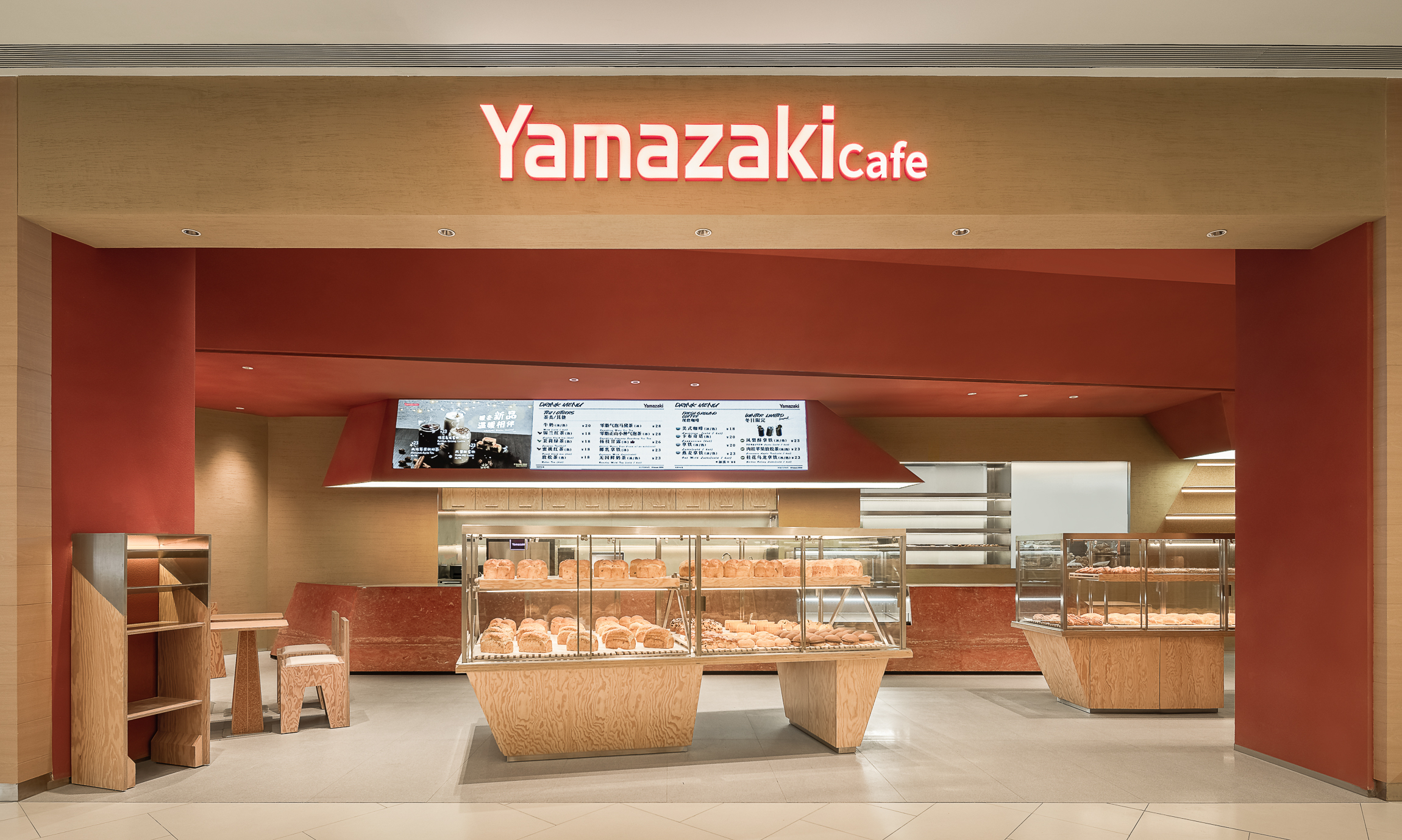
Mount Fuji is a symbol of Japanese spiritual culture. Mountain also represent strength, tenacity and eternity. Therefore, with “hill” as the theme, with geometric blocks such as triangles and trapezoids in the space. The space follows the red of the logo as the main color, supplemented by the use of exaggerated pine grains as the material for display cabinets, tables and chairs.
Considering that the store was set up on the second basement floor, adjacent to the Japanese food street and the future subway entrance, opposite is Jiuguang’s ace “The Fresh Mart”, the flow of people is very huge. After many discussions with the client, we decided to adjust the moving line appropriately,and open all the facades facing the mall. Let the public area be fully connected with the store, and “guide” customers into the store to select bread, also without too much impact with the checkout team, so that the store was always crowded. The plane layout, we rotated the large bread cabinet by 15°-30°, in order to increase the size of the entrance, the design method was used to guide the customer’s direction of travel.
The massive volume ceiling and the lines made the whole space more capable and concise, the cashier bar, tables, chairs, and cake cabinets are all inspired by the hills. The bar was evolved from an abstract mountain shape, we cut and got two blocks. The lower one was the cashier bar with red travertine, and the upper one was the poster display.

