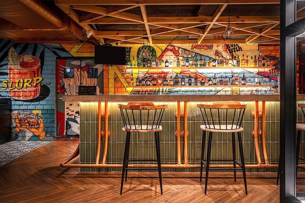
A crimson red structure that stands tall amidst a rapidly developing neighborhood – Zonkk’s facade is designed to create intrigue. The 60s inspired graphic art on the facade, embodies the underlying casual free-spirited theme of the space. It wraps around the building, layered with a colonnade of arches. It further creates a visual connection with the activity inside the building. The signage is designed as striking individual letters that embellish the facade.The overall bold form establishes the restobar’s presence in the neighborhood; the crimson red facade forming a striking image on the skyline.Upon entering, the quirky yet cozy interiors make for a warm and inviting ambience. To disguise the existing angled wall, the flooring is made interesting. A curvilinear pattern of wooden flooring and printed tiles de-emphasizes the slanting wall. The curve also creates an interesting visual segregation between the seating and the bar counter.Chestnut brown acoustic ceiling and wooden flooring envelope the space, forming a predominantly muted palette, complemented by canary yellows, deep blues and sage green. The series of booth seats create a cozy dining experience. Elements like the cane partitions and pendants, the wooden table tops add warmth to the space. The columns are treated with exposed concrete finish layered with backlit MS framework and mesh.Overlooking the lovely cityscape, the high tables take advantage of the vantage point. The arched frames along the glazing, frame the views. The three-seater high sofa is a custom-designed furniture, to add a whimsical touch to the space. The colourful upholsteries give a pop, complementing the industrial vibe of this corner. A juxtaposition of warm and cold materials, such as wood and cast iron, cane and metal mesh, is used to create a quirky yet casual vibe.Inspired by comic strips, the bar back wall art was illustrated to embody the casual and quirky theme of the bar. The vibrant colours uplift the space. The ceiling installation above the bar counter, creates a feeling of canopy over it, and demarcates the bar counter from the rest of the areas. While the copper foot rail and concrete bar countertop create an industrial feeling, the warmth of the pinewood ceiling installation and wooden bar chairs balance it out. The glazed sage green subway tiles add a lovely highlight to the bar counter.The washrooms’ patterned black and white tile on an auburn base forms the feature element, the tiles folding from the walls to the floor. The brass pipes are a nod to the bar counter’s foot rail detail and add an industrial touch. The profile lights highlight the brass framed oblong mirrors. On the whole, the washrooms maintains the design language of the bar interiors, while keeping it interesting.Vibrant red paneled glass walls enclose the smoking zone. The glazing helps maintain visual connection with the rest of the bar. The black brick wall, red frames, the wooden flooring and ledge form the perfect base for the illustration.On the whole, Zonkk is designed with two contrary approaches; the façade is designed to create a bold presence, while the interiors are intended to feel unpretentious – creating a warm and inviting ambience using a blend of quirky and industrial aesthetics, to provide an interesting dining experience.

